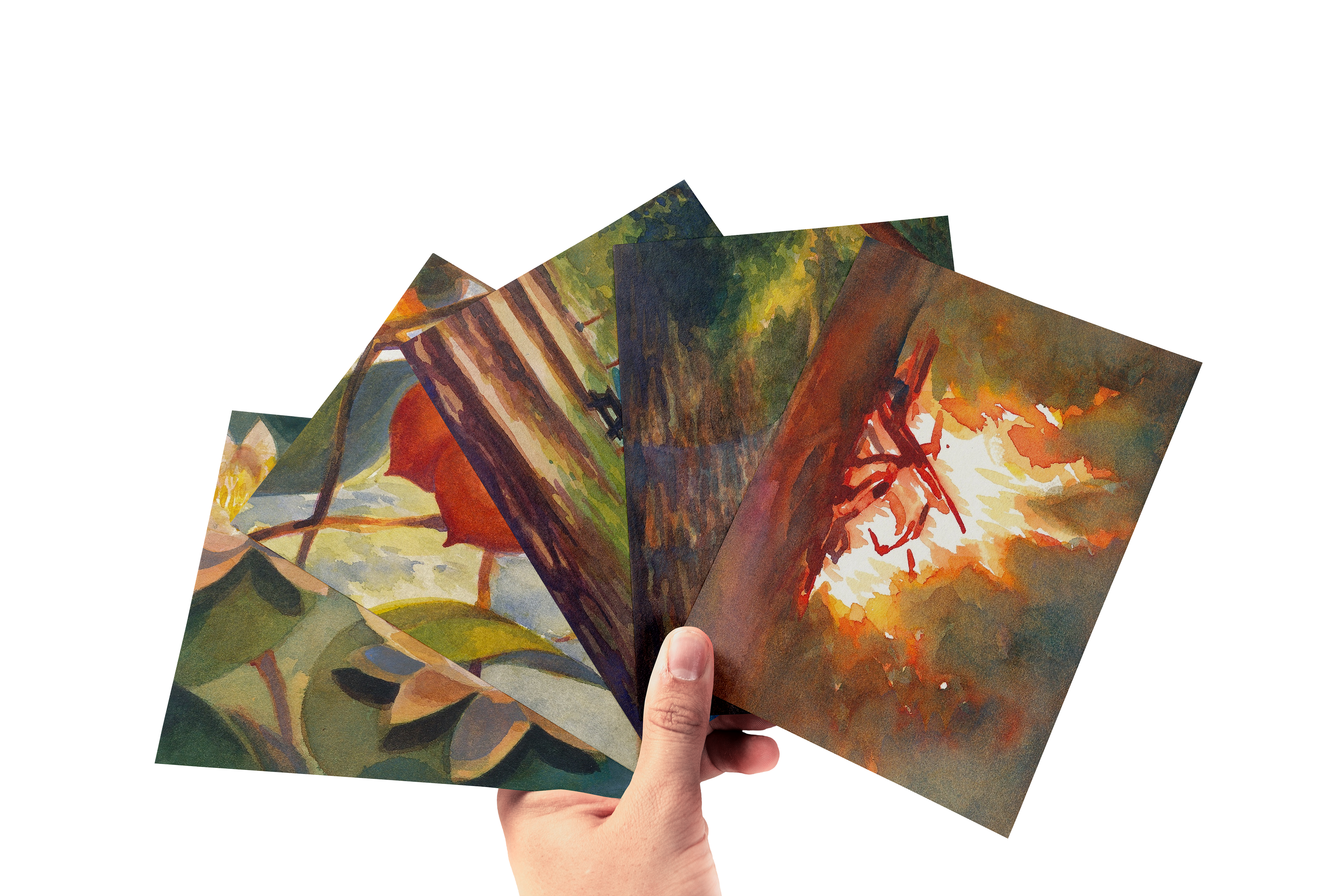
This is a series of postcards inspired by quiet scenes from Sesquicentennial State Park, hence naming this Quiet Scenes. I frequent this park, lovingly called "Sesqui" by locals, during the summer and wanted to inspire more people to visit this slice of nature nestled within a bustling city.
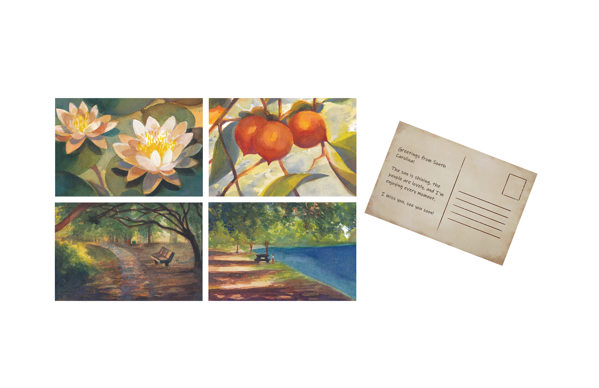
For the back of the postcards, I wanted to mimic the texture and color of aged paper, which I created by overlapping several images of scanned papers and adding more grit with texture brushes. Then, I brought the image into Illustrator to format for post.
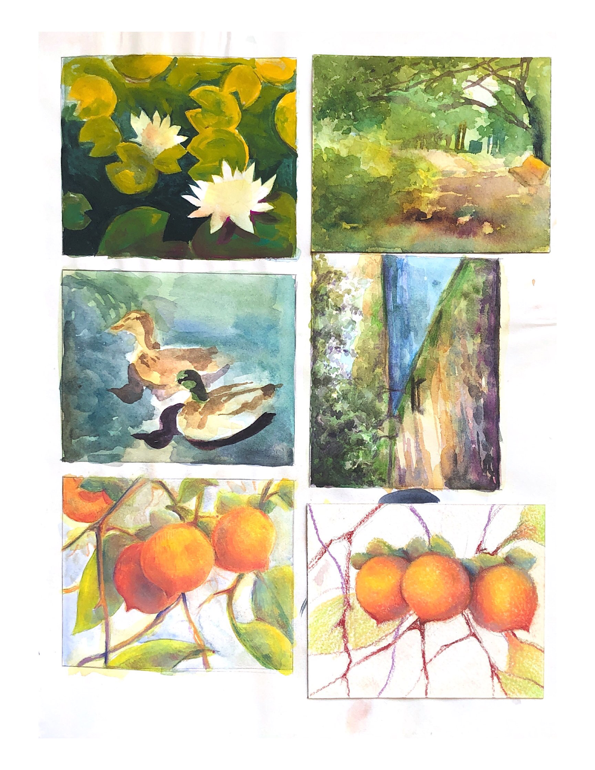
Every illustration featured on the front of the cards were created with a base of watercolor paints with gouache layered over for detailing. These initial sketches feature soft pastels and colored pencils from the beginning stages of deciding on a medium. Pastels were too messy for my liking and the colored pencils left too many white specks(unfilled space) on textured paper.
To ensure they all looked like they were a part of the same series, I limited the color selection and mixed them within in the same palette, so every color has a little bit of another. I did not end up selecting the ducks since they were the only animals depicted, whereas the other postcards leaned more towards being snapshots of the landscape.